Critical Reflection of My film Making Process
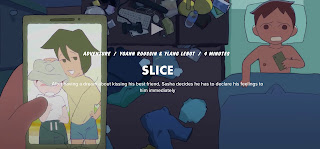
My film represents the life of teenage girls and how awkward it can be to exist in our society. Making friends and putting yourself out there is often difficult. It can be seen as cringy or weird to do so, and the film displays that perfectly. The girls start as complete strangers, and by chance, they meet in an elevator. They go on a treasure hunt throughout the city and form a friendship as they discover clues. The movie is awkward and not the best I’ve made taking this class, but I believe it shows the cringy, awkward vibes all teenagers face when meeting new people. This also shows how the chance to meet a new person can become good, even if there is an awkward start. The film represents the uncomfortable feelings we face in the teenage years and how they are only a moment in time. The sentiment is often rooted in teenagers’ social anxiety because of the intense hormones flowing through our bodies during those years. It’s usually not talked about, even though most teenagers experience the feeling of nervousness while talking to new people. Rylie displays the sense by giving one-word answers and trying to engage in small talk while still seeking protection from the headphones. Anything to drown out the possibility of having to talk to someone, she slowly succeeds and takes them off entirely but remains hesitant. While acting, I did my best to represent the feeling that teenagers experience of being awkward and navigating new things in life, such as making connections.
The brand we created with Chance Encounter was attempting to keep true to the fact that they are teenagers and live in the beautiful beach town of Fort Lauderdale, but also the fact that it is an adventure movie about a treasure hunt. This task was daunting, but we managed to get our message across. The film’s original concept was more focused on the fact they live in Fort Lauderdale. Which is where the clues all came from and why they’re located around the city. We wanted to pay homage to this, so we used many beach scenes and pictures in the development of the website. To keep the youthful feel of the branding, we used fun fonts and bright colors for the titles. We used the same font and bright blue color in our film as our logo, which we posted to all our social media platforms. We also used consistent biographies for our social media and tried to create a unique brand recognizable across all of the platforms. For the adventure aspect, I made a postcard with premiere dates that looks like an old pirate map. It’s similar to the one we used in the film. We wanted to look consistent and professional in our brand while still showing that it was a film about teenagers on an adventure. We are also premiering it for the first time in the U.S. at a local festival to keep true to the nature of Fort Lauderdale and how it affects our movie.
Our product engages with the audience through our branding, our message, and the film’s visuals. The film features many different locations around Fort Lauderdale, showcasing the city’s natural beauty. It also features several eye-catching transitions that blend seamlessly. One is when Sam grabs the poster from Rylie, and she turns around. It cuts to the exact same position and continues the scene seamlessly. The film is the most engaging with visuals. They have a professional quality appearance that helps with the awkward plot of the film. We also used our trailer to engage audiences on social media. It features audio from the film and brief clips as a teaser of what to expect. The most exciting aspect of the film is the ‘what if.’ It builds anticipation as white flashes appear on the screen right before they open the grand prize. The what if represents that hesitation of life. If Sam hadn’t run to catch the elevator, she would have missed out on a great friendship and adventure. The ‘what if’ in our film mirrors the original by her having the same phone conversation in the exact location and showing the same walkway where they were looking at the poster together. We ended the film with a positive message about not hesitating in life. The film is supposed to represent taking risks and not hesitating. You should use every opportunity you can to make friends and take adventures. We only get one life, so using it to the fullest is important.
Our film used many conventions we found in the adventure genre, but it also challenged them. The first convention we used was the camera angles. We used Establishing Shots to show the location that the clues took the girls to. We also used medium shots to emphasize the girls interacting with the environment and looking for clues. The next convention we used was Mis-en-Scene; we matched the conventions a lot in the adventure genre with the costumes. They are supposed to match the location, which is why the girls are in summery beach attire. We also didn’t wear makeup since the genre focuses on action and not appearances. To match the next convention in editing, we used Quick cuts to create suspense, such as in the scene of the girls opening the red treasure box. For the sound convention, we used a voiceover at the end to enhance the message that our film created. We challenged conventions in our film as well. Our film lacks the fast-paced script that is typical in adventure movies. We also do not give our characters any weapons. This prevents them from having power which is typically displayed in an adventure movie. There are also no natural action-packed scenes or fighting scenes. We didn’t want to create a film with violence and instead wanted to focus on friendship. After doing more research due to the doubt that our movie lacked too many conventions, we may have accidentally created a buddy film, a sub-genre of adventure movies. It focuses more on the friendships built because of adventure.
.jpg)
Comments
Post a Comment