The Last Touches
Now is the time for the last few
touches on the film. I still needed to address the lighting issues from the
film review. There was some glare on a few clips and a few dull sections. So, we
turned down the brightness in the clips and adjusted the exposure. This took
care of the glare. Then we did the opposite. We turned up the brightness and adjusted
the exposure and contrast with gave the brightness needed. This took care of
the last aesthetics of the film. But it was time to move on to the last aspect…
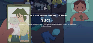
the titles. We started by going onto CapCut and picking out different fonts we liked.
Then
narrowed down that list to 1 that we all agreed on. We ended up going with the
Font called Mokgech. It’s a traditional medieval-looking font that sparked a
feeling of adventure. We are going to use black as the font color. And they’re
all going to come in and exit the same way at the bottom right corner. There is
a fade effect applied to help with the subtle look. It’s our preferred style because
we feel the attention should be on the movie, not the titles. It’s been a long
journey seeing the finishing touches come together. I’m proud of our work, and
we can’t wait to show it to you soon!

Comments
Post a Comment